Five Ways to Style: Chequerboard
By Ruth Webber
Jan 30, 2023
Our Creative Director Ruth Webber takes us through five of her favourite Chequerboard looks...
Over the last couple of years chequered patterns have been seen everywhere, checks have touched just about every surface of interiors, and I think it is worth tapping into this. However, this is more than a passing trend, it has a timeless and classical appeal. The look can genuinely work anywhere. You can put it in a farmhouse or a contemporary setting. It’s about finding your own checkered way of doing it.
All over checks
A softer palette with small delicate squares allows a seemingly bold concept to appear subtle and understated. It’s the balance of a pastel palette and natural materials.

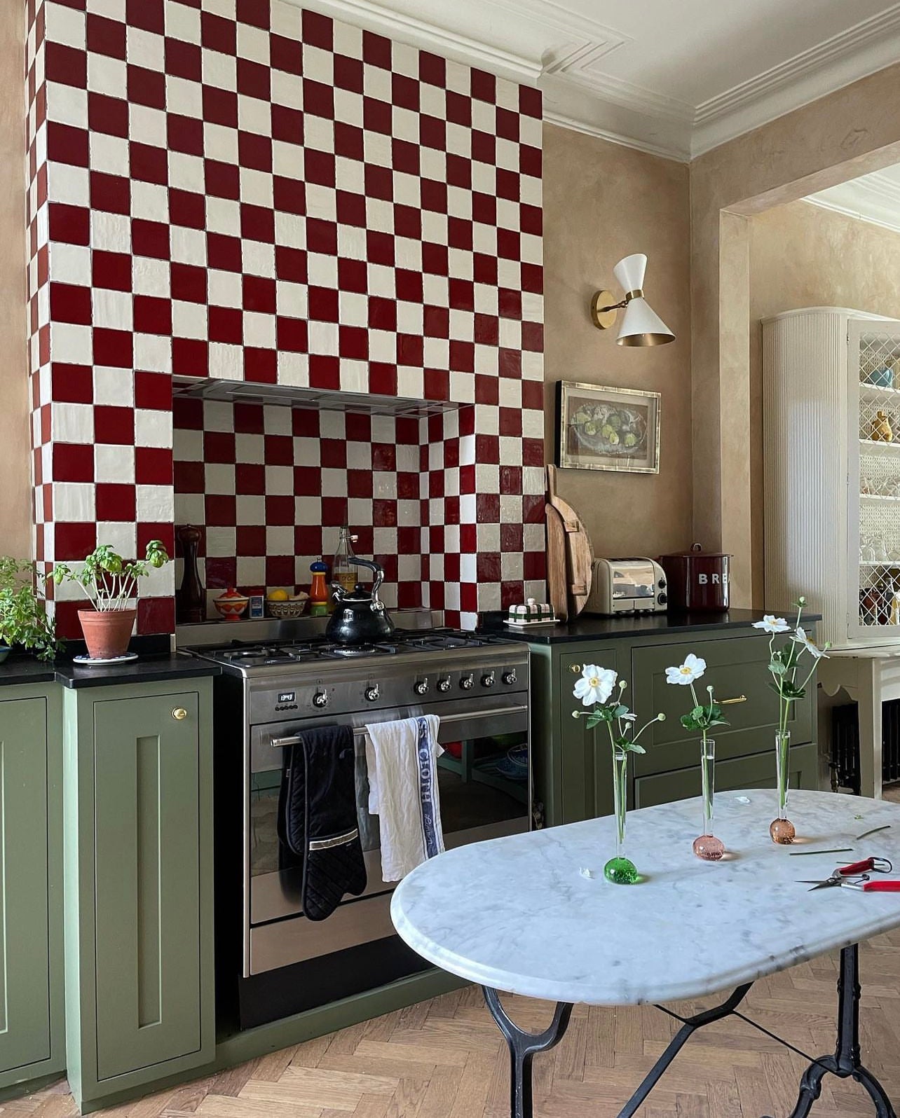
Feature wall
Make a statement with strong contrasting colours in a key area. The pattern is isolated, making a bold statement, but not overwhelming the space.

Credits: @matildagoad
Understated
A timeless look. Pairing back the palette, and going for larger checks, easing in a touch of chequerboard in your interior.

Credits: Landscape Lodge, by Louise Curnuck
Diagonal chequerboard
Diagonal chequerboard creates the illusion of space, even in the smallest of spaces. This look can be achieved by using our Alalpardo tile to form a larger diagonal pattern.

Oversized
Black and white flooring in an oversized chequerboard unites a space like at No1 Duke Street restaurant. Great for larger rooms and for big impact. Create the larger checks by combining plains with the classic Alalpardo.


